Everything you need to create a functional and appealing website
Every successful business has a beautiful and functional website. How can you achieve one? If you currently have one, then you know creating a website can be overwhelming. Focusing on key points then taking it one step at a time will feel less stressful. Here’s your guide to everything your spa website needs to make it simple.
The Home Page
This is the first place potential clients will land on when they type in your website’s URL. This is one of the most important parts of your website and will leave a lasting first impression. Here you can establish your specific brand and business. Having a quality photo of your work spa is a great option here to set the tone and invite them in. This also means making sure not to overwhelm visitors with 10 popups. I would keep it to one or two at the maximum.
Navigation
Having a Header Menu and Footer on each page of your website is so crucial. When building and designing your site, make it a point to keep the viewer in mind – always! They will want things visible and accessible, so a little hand holding is necessary.
In your Header, or a drop-down menu, list and link other pages of your site for easy navigation. Great examples of this will be call to actions like Services or Shop. If someone is confused on navigating your through site, they will leave and you can lose that potential client. These options also work great in a Footer, and having this information in both will be set you up for success.
The Treatment Menu
The heart of any spa is the treatment menu. Make sure to list all services neatly. If you provide different types of services, categorize them. This way, visitors know exactly where to go for what they are looking for. Make sure to list a brief description and duration of time and price to answer all of their potential questions.
[ihc-hide-content ihc_mb_type=”block” ihc_mb_who=”all” ihc_mb_template=”3″ ]The Contact Page
Having a point of contact for clients will save everyone time. This can be done successfully two different ways – having a whole page dedicated to it or having some quick information in the Footer. Here, include a phone number to call and/or an email. Listing your address will also be extremely helpful to let clients know where to find you.
Your Online Shop
Setting up a beautiful website often feels unfinished if you don’t include a Shop section, especially if you sell retail in-office. Anyone browsing can quickly and easily support your business by simply purchasing a cleanser. If you don’t currently have an eCommerce, I highly recommend looking into it.
Bragging Rights
Now, it’s time to brag! Why should someone come to you versus the next service provider? Create an About Page and be sure to highlight important information you’d like clients to know about your spa. Display headshots and a biography of each practitioner.
Showcase your Space
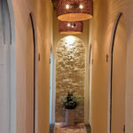
Showcasing your space can be done tastefully with professional shots, touring the spaces clients will and want to see when they visit. These shots can include your luxurious waiting area, your beautifully mounted sign/logo, an Instagramable feature wall and your relaxing treatment room(s). Other great photos to incorporate are any before/after images you are proud of. This gives you credibility and makes clients hopeful.
Remember, It’s all in the Details
As mentioned before, visitors will need hand holding and need key information to be in their face. Posting your hours is so critical to let people know when they can reach out or come in for a service. I recommend keeping this in your Footer so it shows up on every page.
Your website should be the gateway to everything having to do with your brand. Make sure to include links to any social media outlets so visitors can get a better look at what you’re doing. This is another great addition to your Footer.
Through your website you can easily reinforce your brand by making sure to pay close attention to a few things. Make sure to match things with strong visuals – a memorable logo, color schemes and even the fonts you use. Consistency is key here.
[/ihc-hide-content]


